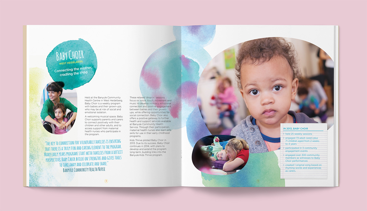
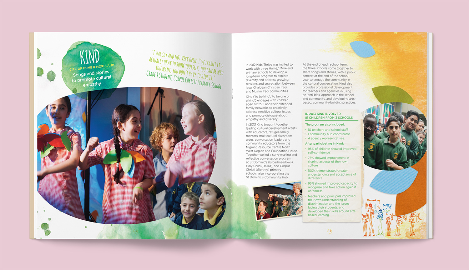
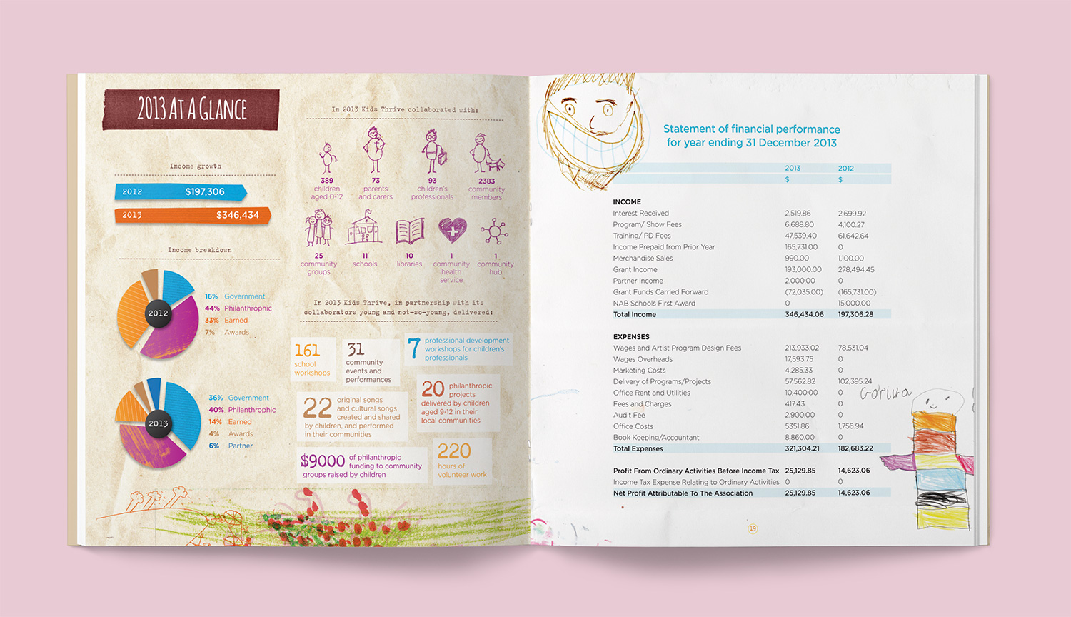
Tall Architects
Website design for Tall Architects by Atticus Design
Business card design for Tall Architects by Atticus Design

Brief

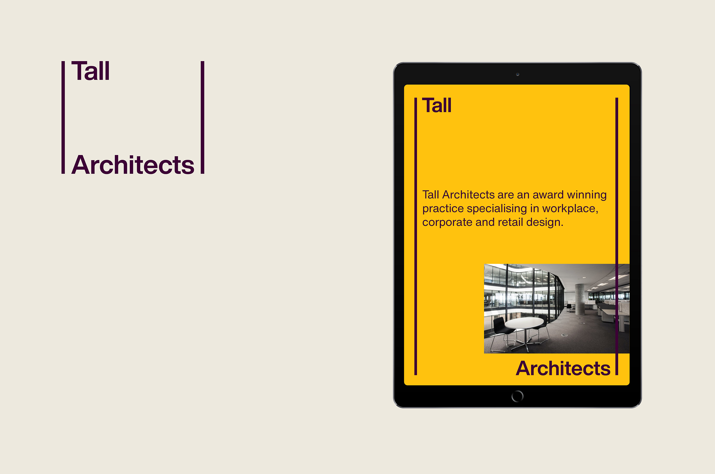
Tall Architects specialise in corporate, workplace and retail design. The firm prides itself on its agile and responsive approach to creating adaptable, dynamic spaces in which people can move, work, interact, engage and connect.

The task: to redesign the firm’s identity to better reflect its core clientele; and to create a design system across print and digital. 

The constraints: re-imagine the firm’s long-held original logo designed by its founder; and honour his deep love of Helvetica.

Solution

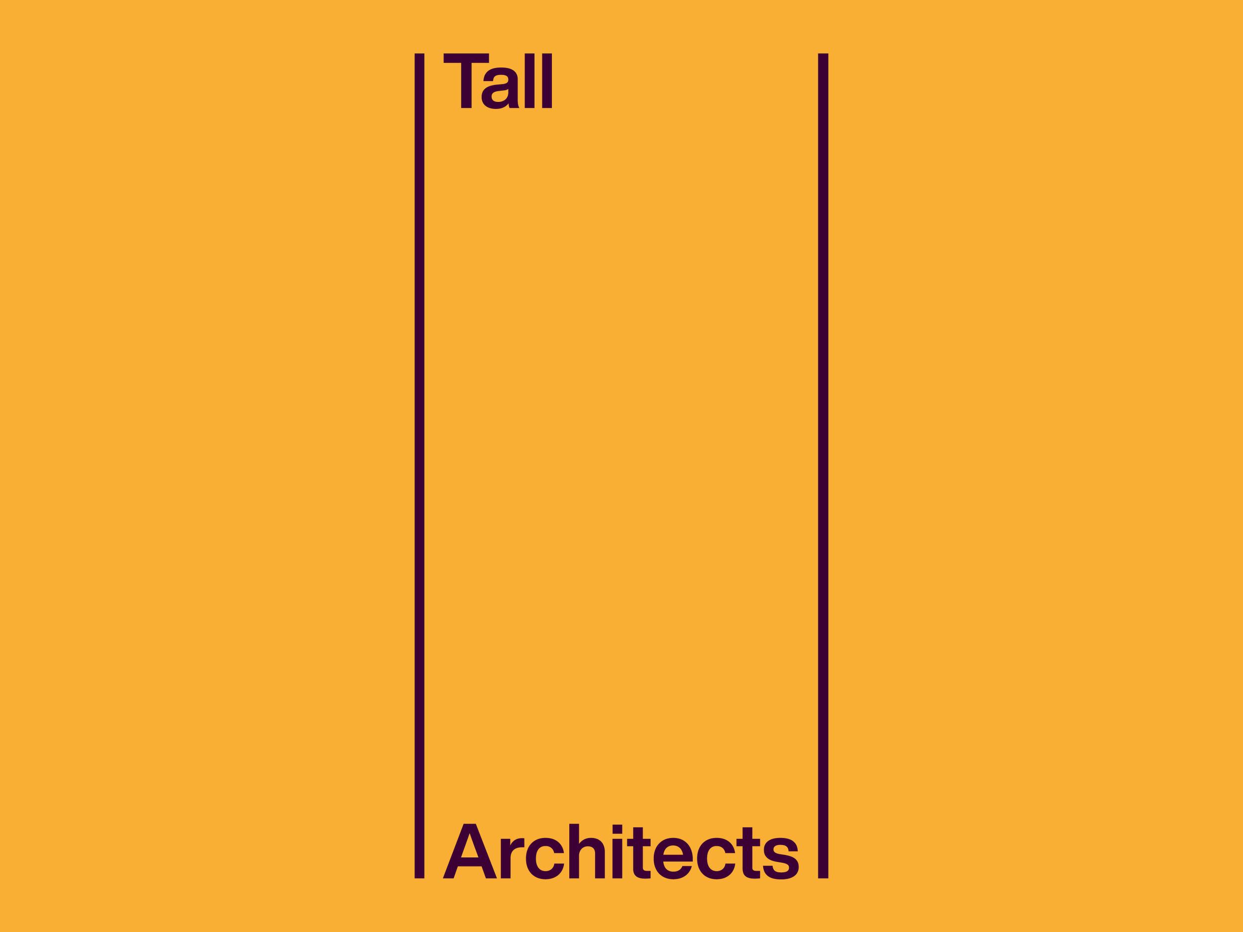
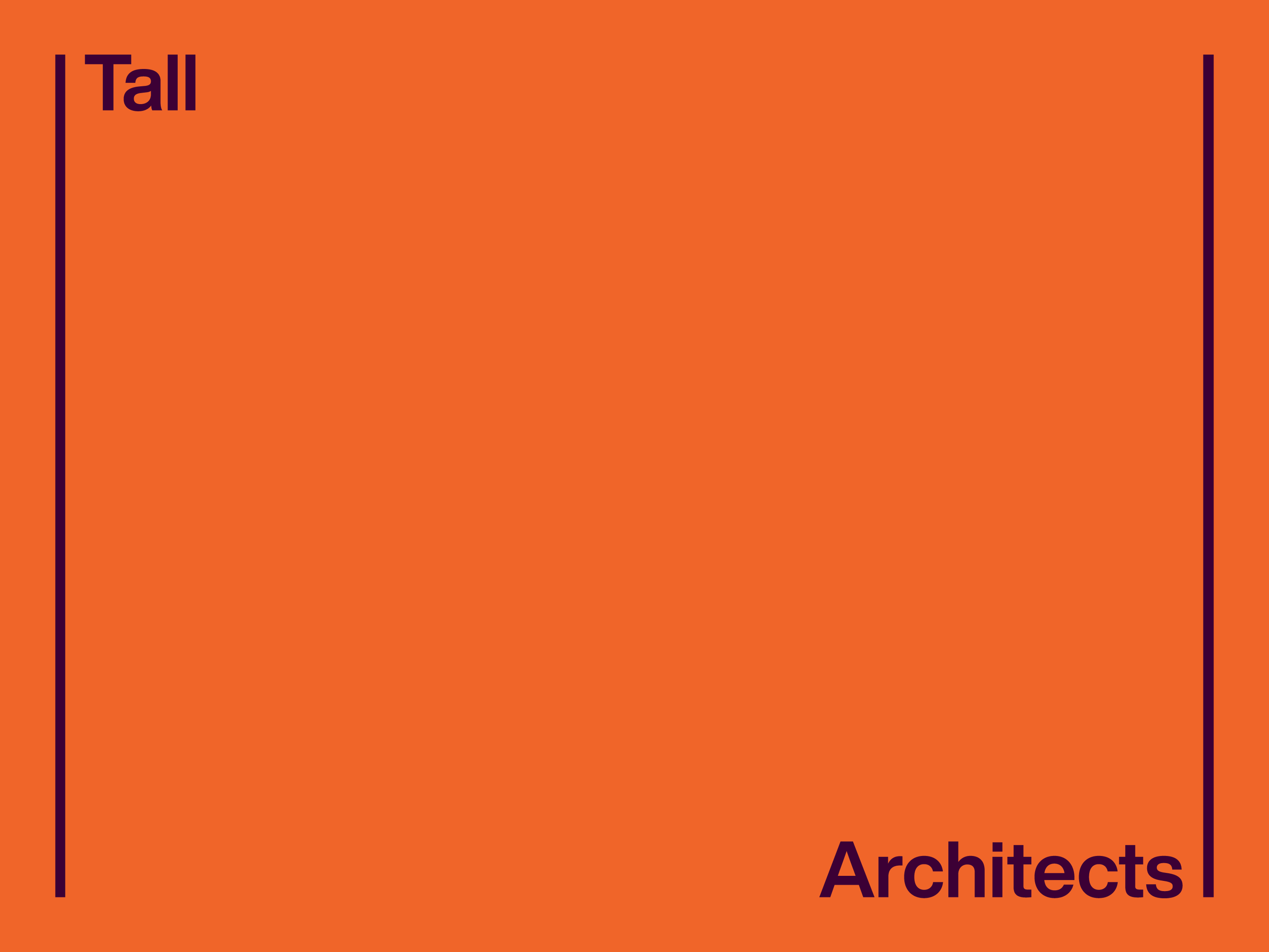
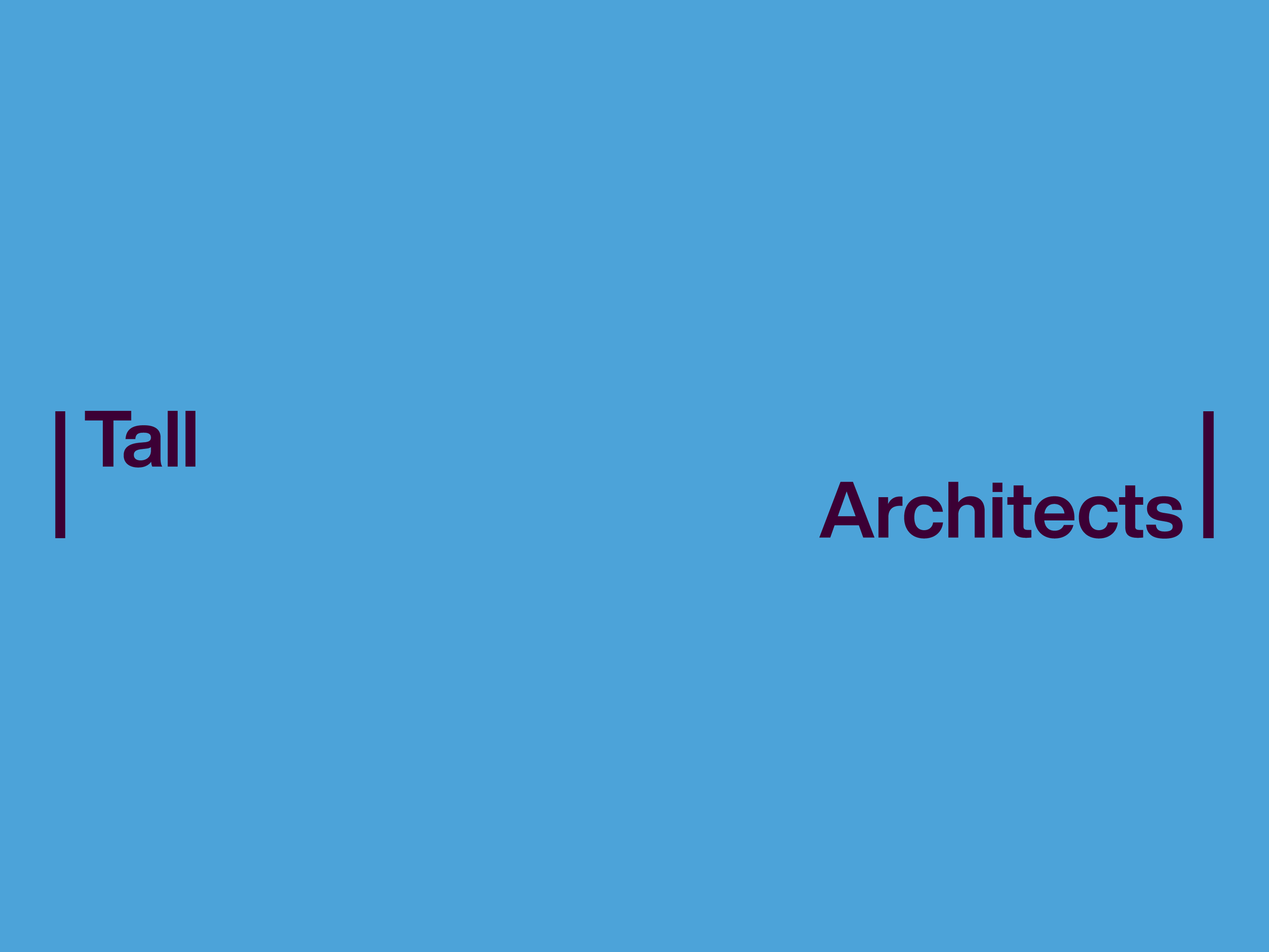
Like Tall Architect’s creations, we wanted the identity to be active rather than static - a moving body with a heart and soul. Our identity has the ability to flex, stretch, contract and flow, responsive to the space it inhabits.

Using the new release of Monotypes Helvetica Now, we retained the essence of the previous identity while building a stronger and more versatile design system, paired with a fresh and unexpected colour palette. The end result is simple, unexpected and unique - a playful use of frame and composition, paired with a suite of warm, seasonal backdrops.

Our design solution was also a finalist in the Australian Graphic Design Association (AGDA) Design Awards 2020.

tallarchitects.com

Conlan Cummings Lawyers
Business card design for Conlan Cummings Lawyers by Atticus Design
Stationery design for Conlan Cummings Lawyers by Atticus Design
Signage design for Conlan Cummings Lawyers

Established by Gerard Conlan in 1971, Conlan Cummings Lawyers advise and represent in all areas of the law. Operating in the early days as Law 554 (featuring branding by Atticus), the firm recently took on its new business name when Elizabeth Cummings stepped up to join her father Gerard as Partner.

Atticus Design collaborated with the clever minds at By All Means to create a new logo and branding for the firm. The new logo represents the father/daughter professional alliance with the interlocking of the letters ‘C’ from Conlan and Cummings; one letter printed and the other as a silhouette, both complimenting the other.

The new branding needed to sit comfortably with the existing interior design and architecture of the building, while also reflecting the firm's well-established reputation of professionalism, integrity and style.

The business card features a clear foil pressed onto the green of the logo, printed on a beautiful stock by Ball and Doggett, Strathmore Soft White. The project also included signage design on the street and in the reception area, a new website, and design of internal document templates.

conlancummings.com.au

Big West Festival 2015

Big West Festival is a community-based, contemporary arts festival presenting multicultural and multi-artform events in venues, cultural sites and suburban streets of Melbourne’s western suburbs.

The theme for the 2015 Festival was ‘Open House - The Inner and Outer World of the House’. One of the Festival's key events was the building of a shell of a house, designed as a prototype for a model of affordable, social housing, particularly for single women-headed households. As well as offering a sustainable solution for social housing, the project aimed to raise awareness of increasing homelessness, particularly of women, in the western suburbs.

The design brief was to create an uplifting and celebratory festival identity that subverted notions around the placement of art in daily life. The Big West Festival pointedly takes art off its pedestal: performances spill out from venue to street to parking lot; local traders rub shoulders with artists; the prosaic is transformed into the imaginative. And all set against the backdrop of a rapidly transforming, utterly original and always surprising landscape of the west. 

Reflecting on our own personal experiences in Footscray, Atticus created a design that aimed to embody this charming and often schizophrenic landscape. Our concept for the festival was an illustration of community members exploring the many chambers, colours, and textures of Footscray. Beautiful, kooky, ugly, blinding, and poetic.

Sustainability in Schools

The Australian Education for Sustainability Alliance (AESA) is comprised of organisations from the education, union, youth and environment sectors that want a higher prioritisation of sustainability in the education system.

Atticus Design was engaged to create a suite of design solutions for the Getting Started with Sustainability in Schools project - including identity, website design, illustration icons, and website development - aimed to engage educators on the topic of sustainability, and to encourage them to include it in their daily teaching. A responsive website was created for teachers to access and navigate content whether researching information out of class, or on the fly in the classroom.

Atticus worked with the clever chaps at Long Division Digital to develop the website for this project.

www.sustainabilityinschools.edu.au

Mira's Table

Mira’s Table is an authentic Moroccan gourmet food company that works directly with women’s cooperatives in Morocco that maintain the south western region’s Unesco-protected Argania forests. Mira's Table products use eco-certified Argan oil and include Culinary Oil, Amlou, and Chocolate Amlou. Yum! A decadent replacement to peanut butter on toast.

Atticus's design of the brand identity, packaging, and promotional material reflects the lush, exotic flavours of the product range created for the Australasian market, using contemporary patterns and colour.

Limbs 4 Kids

Limbs 4 Kids provides support for children and young people with limb differences and their families. Limbs 4 Kids is a sub-brand of Limbs 4 Life, who provide support for amputees, their families, caregivers and health care providers. 

Our role was to create a logo and brand for Limbs 4 Kids using the same recognisable motif as that of its parent company: the number ‘4’ being made up of crossed prosthetic limbs. The new design featured the addition of a ‘thumbs up’ in the hand of the arm, embodying the spirit and energy expressed by the children and young people supported by Limbs 4 Kids.

Bright, energetic colours combined with modern, organic shapes have been applied across stationery, print, and digital platforms, capturing Limbs 4 Kids' positive and life-changing work.

limbs4kids.org.au

ATEP

ATEP (Apprenticeship and Traineeship Employment Partners) recruit, employ and induct apprentices and trainees in a range of trades across Victoria.

Atticus Design was engaged to conduct an extensive brand review, and then embark on renaming and rebranding the organisation. The new name, and strong and confident design, aimed to re-position ATEP as a leader in the industry. This new design was also applied to print, signage, and digital platforms.

The simple mark in the logo represents the support, development, and growth between an apprentice or trainee and their mentor.

Art of Difference Festival

Have you ever seen a musical performance by a deaf and blind pianist? Or a dance production by deaf performers, with no soundtrack?

The Art of Difference Disability and Deaf Arts Festival, staged in 2009 at Gasworks Arts Park, was like no other festival we have ever experienced. Running for two weeks, this international arts festival showcased some of the best and most innovative visual, performing, literary and new media artists.

Anything Atticus created needed to be accessible to visually impaired and deaf audiences. We designed an arresting icon for the festival with face-like features combining the letter ‘D’ overlapped by the braille character ‘D’. D for disability and D for difference.

The design of the material for the festival was carefully considered to be accessible on all levels, and was applied to program design, advertising, badges and t-shirts.

We hope that the Art of Difference Festival comes back to Melbourne sometime soon.

Victorian Legal Admissions Board

The Victorian Legal Admissions Board (VLAB) assesses applicants for admission into the Victorian legal system, and grants their approval or disapproval based on their qualifications.

We were honoured with the task of designing a new brand for VLAB. Our inspiration for this project came from the formidable architecture of the courts district of Melbourne (for example, the columns outside the law courts) while also alluding to the pathways undertaken by legal applicants.

The new design created a strong and contemporary image for VLAB, and saw the custom letter forms emblazoned across the windows of their reception area.

lawadmissions.vic.gov.au

Australian Red Cross Evacuation Centre Guides

Weather patterns in Queensland in Northern Australia can be highly unpredictable, delivering anything from severe drought and floods, to tropical cyclones. Red Cross Australia and Emergency Management Queensland provide support to communities affected and displaced in these situations. The Emergency Management Handbooks provide guidance to support personnel working in evacuation centres when these types of disasters strike.

Our design needed to be informative, highly accessible and easy to navigate for volunteers and professionals involved. Each book contains detailed information, diagrams and quick-reference materials. The design features illustrations of iconic Queensland imagery across the suite of handbooks.  

Printed on a waterproof synthetic stock the books are able to withstand use in any situation come rain, hail, or shine.

Big West Festival 2009

Big West is a curated, multi-art form, multicultural festival staged biennially in Footscray and surrounds. The theme for the 2009 festival was ‘Home is Where the Art Is’, and explored the place of art in the everyday, how notions of art change depending on the cultural lens, and art as life (versus hidden in galleries and shrouded in theory).

We knew that the festival program included a large contingent of craft-based work (guerrilla knitting, woven architectural installations to name but a few) and our design needed to reflect this. The resulting festival identity playfully captured the image of a typical suburban home, complete with a trio of seagulls as wall decor. The image was entirely handmade utilising the skills of the local knitting club (bless their woollen socks). As you flicked through the pages of the program guide the wallpaper designs changed, as if meandering through different rooms in an actual house.

The festival identity was used across a long list of promotional material for the festival, and we even got to hang on to ‘Sid the Seagull’ as a keepsake. Apologies to Mum for never returning the knitting needles.

Oakleigh Music Festival 2016

Set in the surrounds of Warrawee Park, the Oakleigh Music Festival, presented by City of Monash, celebrates all that is local in food, art, music and culture.

Our concept for the festival identity showed how Warrawee Park comes alive during the festival, and that it’s not just community members that get involved. The tall gum trees in the park provided the perfect backdrop to illustrate a menagerie of wildlife busy cooking up a storm and performing on musical instruments, entertaining the community below.

Kids Thrive Annual Report 2014

Kids Thrive is a not-for-profit organisation that works with schools in disadvantaged areas across Victoria. Their programs tackle issues that children experience arising from trauma, disadvantage and cultural conflict; and expand children’s creativity, communication and social skills.

Aided by illustrations from children participating in Kids Thrive programs, we created an annual report that expresses both the inspiring work of the organisation, along with the creativity, resilience and optimism of the young people it engages with.

To view this and other annual reports we’ve created for Kids Thrive over the years, go to kidsthrive.org.au.